← All Work
Workspan

Head of User Experience  ·  2019 – 2021  ·  Foster City, CA

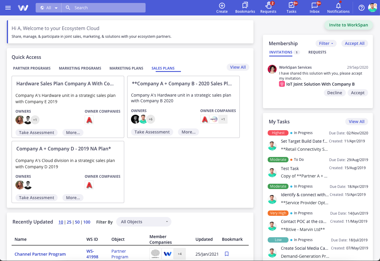
Reframing a Fragmented Product Into a Unified Platform

30%
Time on Task Improvement
1
Design System Shipped
4
Designers
2
Years

WorkSpan was a cloud-based partner ecosystem platform, a genuinely novel product category helping companies co-sell and co-market across organizational boundaries. The technology was innovative, but the user experience told a different story.

The product had been built through several iterative development cycles, each leaving behind its own interaction patterns, navigation logic, and design conventions. The result was an app that felt like three or four different products stitched together, confusing to new users and frustrating to experienced ones.

When I joined as Head of UX, the mandate was clear: unify the experience, establish a design foundation, and make the product something users actually wanted to come back to.

Knowing what not to do first is as important as knowing what to do.

Player-Coach at an
Early-Stage Company.

I led a team of four, including myself as a player-coach, designing alongside the team while setting strategy and direction. This is a mode I'm comfortable in at early-stage companies: the work doesn't wait for headcount, and staying close to the craft makes you a better leader of it.

The team worked in close collaboration with Product and Engineering throughout. One of the early wins I'm most proud of was getting Engineering genuinely excited about the design system, not just compliant with it. More on that below.

WorkSpan — Home view

The decisions that shaped
the outcome.

01

Starting with research, not assumptions.

Before touching a single screen, I led an exhaustive user research study across 25 users: 23 from 8 external customer organizations and 2 from our internal team, who were also active product users. I had the team categorize findings into broken journeys, navigation confusion, bugs, and things that were actually working. The "what's working" category mattered as much as the problems; it told us what not to break.

02

Anchoring design to company goals, not just user complaints.

Research findings are only useful if they're prioritized against something. I led the team through a UX strategy exercise to define the goals that would drive the first iteration of the redesign. We landed on four: Reduce Confusion, Simplify Journeys, Reduce Cognitive Load, and Guided Flows. Onboarding and self-service were real problems too, but we made a deliberate call to defer them to a second iteration. Knowing what not to do first is as important as knowing what to do.

03

Building a design system Engineering actually wanted.

The fragmented UX wasn't just a design problem; it was a codebase problem. Inconsistent patterns had been implemented independently across the product, meaning every fix created maintenance debt. My position was clear: no designer could introduce a new pattern without pitching it to the team first, and if accepted, it went into the system. Equally important, no engineer would implement a one-off component outside the shared library.

What surprised me, and shouldn't have, was how enthusiastically Engineering embraced this. They were tired of maintaining divergent code as much as we were tired of designing around it. That shared frustration became shared ownership, and the component library became a genuine cross-functional asset.

04

Choosing "Fresh yet Familiar" over creative differentiation.

One of the more contested design decisions was the visual and interaction direction. Some stakeholders, particularly on the sales side, saw the redesign as an opportunity to build something bold and distinctive. I pushed back, and the reasoning was grounded in user psychology rather than aesthetic preference.

WorkSpan integrated deeply with CRM and ERP tools that users lived in every day. Straying too far from those interaction patterns would add cognitive load exactly where we needed to reduce it. Jacob's Law is relevant here: users spend most of their time in other products and arrive with strong mental models already formed. Our job was to feel immediately familiar while elevating the quality of the experience, what we called "Fresh yet Familiar."

A product users wanted
to come back to.

30%
Time on Task Improvement
25
Users Researched
1
Design System Shipped

The redesigned product launched to measurably positive results. On tasks centered around finding and acting on objects in task lists, a core daily workflow, time-to-completion improved by 25–30%. That's not a small number for a B2B tool that people use for hours every day; it compounds into real productivity gains across a customer's entire partner team.

Beyond the metrics, we shipped a unified design system with a fully accessible component library that both design and engineering teams used as their source of truth, a foundation the product could grow on rather than accumulate more debt against.

Users spend most of their time in other products and arrive with strong mental models already formed. Our job was to feel immediately familiar while elevating the quality of the experience.